Introduction
When working with human behavior you’ll almost always have to deal with data that is formatted as a time series. Briefly, time series data corresponds with repeated measures of a variable (or multiple variables) at consistent intervals over a period.
At the Center for Wireless and Population Health Systems, we’re consistently dealing with physical activity data collected from accelerometers worn by study participants. These measurement devices sample human locomotion at various rates over periods lasting days, weeks, or even longer. There are a variety of methods to process and analyze accelerometer data, but we know any good statistician will use a variety of visualization techniques so become familiar with the data and understand it better. This document is meant to be an introduction to different methods for visualizing time series data. By no means does it cover every method, but it should get you started and give you some ideas for additional techniques.
The Data
The data used in this example was collected as part of my doctoral dissertation research. The physical activity data was gathered from participants who used a Fitbit activity tracker to measure their physical activity. Access to historical data was granted by participants and downloaded using Fitabase. A variety of data was made available, but for this example we’ll be focusing on steps.
As my dissertation analysis is ongoing, I’m using my own Fitbit data here for this example.
Step Data
I downloaded my step data over a two-year period from Jan. 1, 2012 to Jan. 1, 2014. Two data files will be used in this analysis (click to download the data sets):
The Daily Steps file contains 366 observations of the total amount of steps recorded for each day in 2012 (2012 was a leap year). The Minute-Level Steps file contains 527,040 observations (1,440 minutes per hour, 24 hours, 366 days) of the total steps recorded per minute for 2012.
Let’s load ’em up.
DailySteps <- read.csv("https://www.dropbox.com/s/n4a398int2ffig9/ER_FitbitDailySteps_2012.csv?dl=1")
MinuteSteps <- read.csv("https://www.dropbox.com/s/csmddz7o6sfny52/ER_FitbitMinuteSteps_2012.csv?dl=1")
Cleaning the data
So the data is loaded and a quick glance indicates that the date and date/time vectors were imported as factors. That’s all well and good for most things, but we’re going to want dates as dates and times as times for visualization purposes. Let’s get those corrected. I like using the lubridate package as it handles dates and times very easily. The ActivityDay vector is in mm/dd/yyyy format so we can use the mdy function from lubridate to change it into a POSIXct variable.
library(lubridate)
DailySteps$Date <- mdy(DailySteps$ActivityDay)
DailySteps$Date <- as.Date(DailySteps$Date)
The minute-level data is a bit trickier. The ActivityMinute vector is formatted for date/time in mm/dd/yyyy hh:mm:ss AM/PM. This isn’t super useful for instance, when we want to plot the minute-by-minute steps for a full day of data. So let’s do some reformatting to clean it up.
MinuteSteps$ActivityMinute <- mdy_hms(as.character(MinuteSteps$ActivityMinute))
MinuteSteps$Date <- as.Date(MinuteSteps$ActivityMinute, format = "%Y-%m-%d  %H:%M:%S")
MinuteSteps$Time <- format(as.POSIXct(strptime(MinuteSteps$ActivityMinute, "%Y-%m-%d  %H:%M:%S",tz="")) ,format = "%H:%M")
MinuteSteps$Time <- as.POSIXct(MinuteSteps$Time, format = "%H:%M")
Why four steps to create two variables? Well, we want to make the date, a date variable, and we also want to strip the time to it’s own variable. strptime can do that, but it returns a character vector, which ggplot won’t like when use it as a scale. We have to convert that time character vector back into POSIXct and by doing so we assign it an arbritrary date. If you don’t asssign it in the function then it will automatically assign today’s date.
Bar Plots
I find bar plots a bit easier to read when dealing with aggregated data such as daily step counts. This might be because I envision the volume of the bar to contain the total amount of steps for that day. So let’s make a quick bar plot of the Daily Steps.
Before we begin we’ll need to load two packages: ggplot2 and scales
library(ggplot2)
library(scales)
DailyStepsPlot <- ggplot(DailySteps, aes(x=Date, y=StepTotal)) #This will base plot which we'll manipulate.

DailyStepsPlot + geom_bar(stat="identity") + scale_x_date(breaks=date_breaks("1 month"))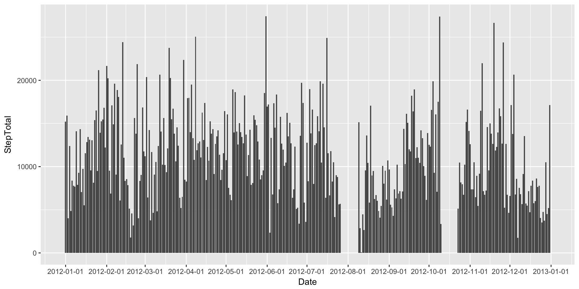
Line Plots
What about a line plot (with added points)?
DailyStepsPlot + geom_line(colour="blue") + geom_point(colour="blue4") + scale_x_date(breaks=date_breaks("3 month"))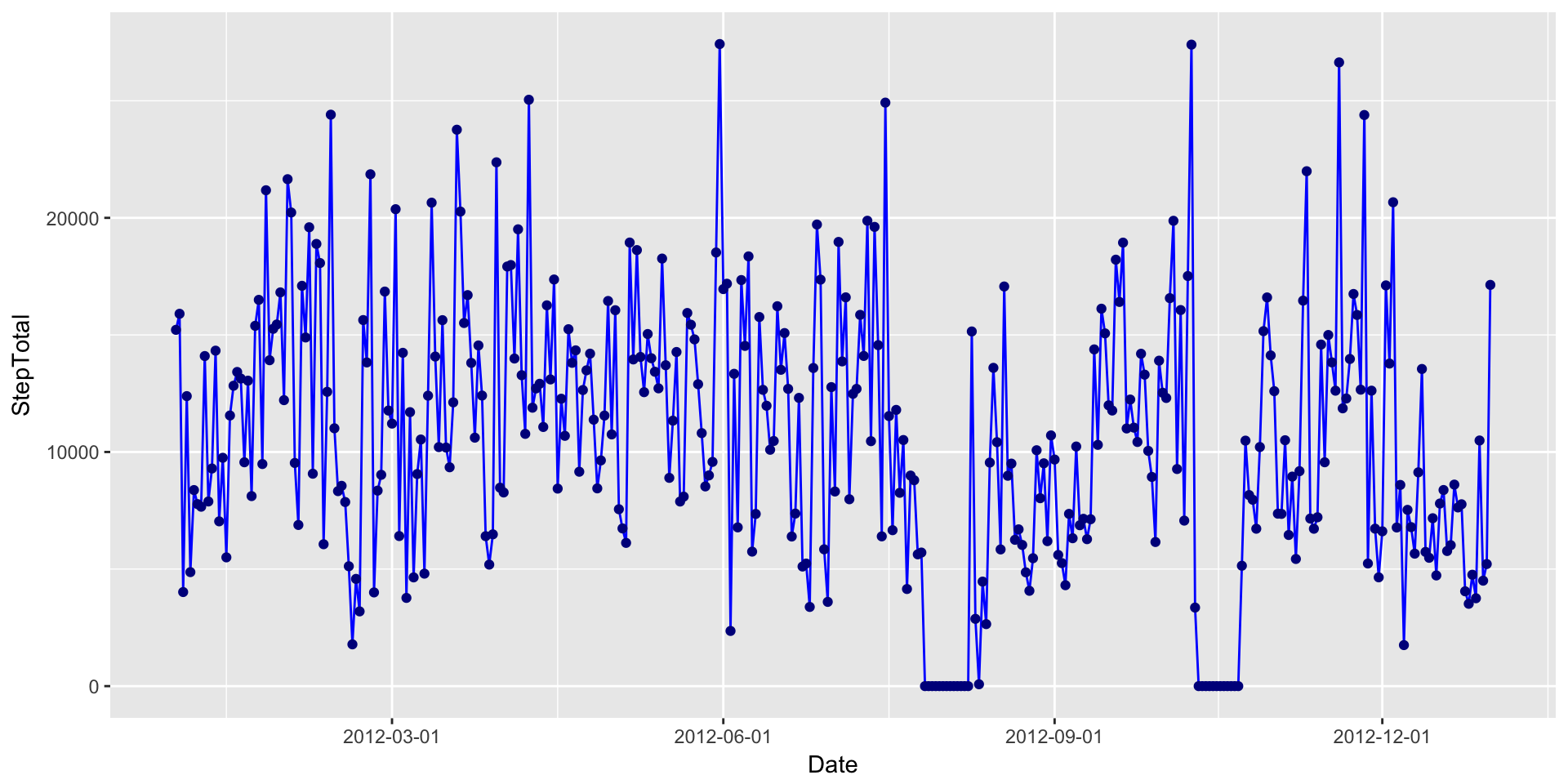
Multiple Line Plots
Line plots aren’t that great when you have a continuous data set that spans over 500,000 observations. For a data set that large we’re typically trying to look into patterns. A good way to do that is to plot the data one level up, such as per day in this case.
We’ll plot each day on the same canvas with each line set to a transparency of alpha = .05. I also cut down the line size so that patterns might be seen in the resulting banding.
ggplot(MinuteSteps, aes(x=Time, y=Steps, group=Date)) +
  geom_path(size=.5, alpha = 0.05, colour="blue") +
  scale_x_datetime(breaks=date_breaks("2 hour"), labels=date_format("%H:%M"))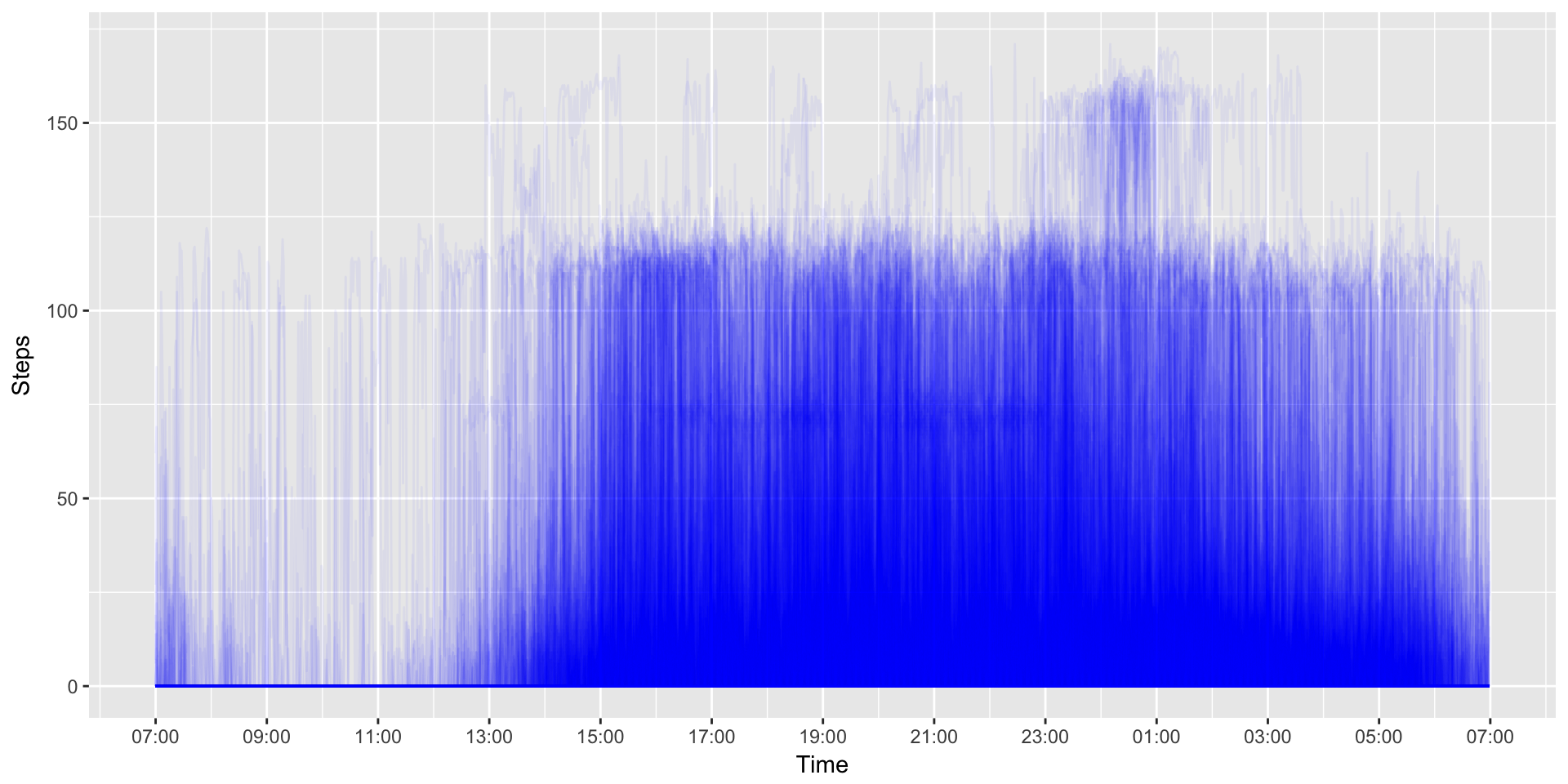
You can see some clear banding at 120 steps/min or so and another a bit lower around 75 steps/min. It also appears that there a few days with periods of high activity (>150 steps/min) just past 6PM (18:00). But, could it be clearer?
Scatterplot
When using the line graph, multiple lines can obscure the patterns we’re trying to tease out by introducing a bit of visual noise. Let’s reduce the noise by taking away the lines and using just points in a scatterplot.
ggplot(MinuteSteps, aes(x=Time, y=Steps, group=Date)) +
  geom_point(size=.5, alpha = 0.1, colour="blue") +
  scale_x_datetime(breaks=date_breaks("2 hour"), labels=date_format("%H:%M"))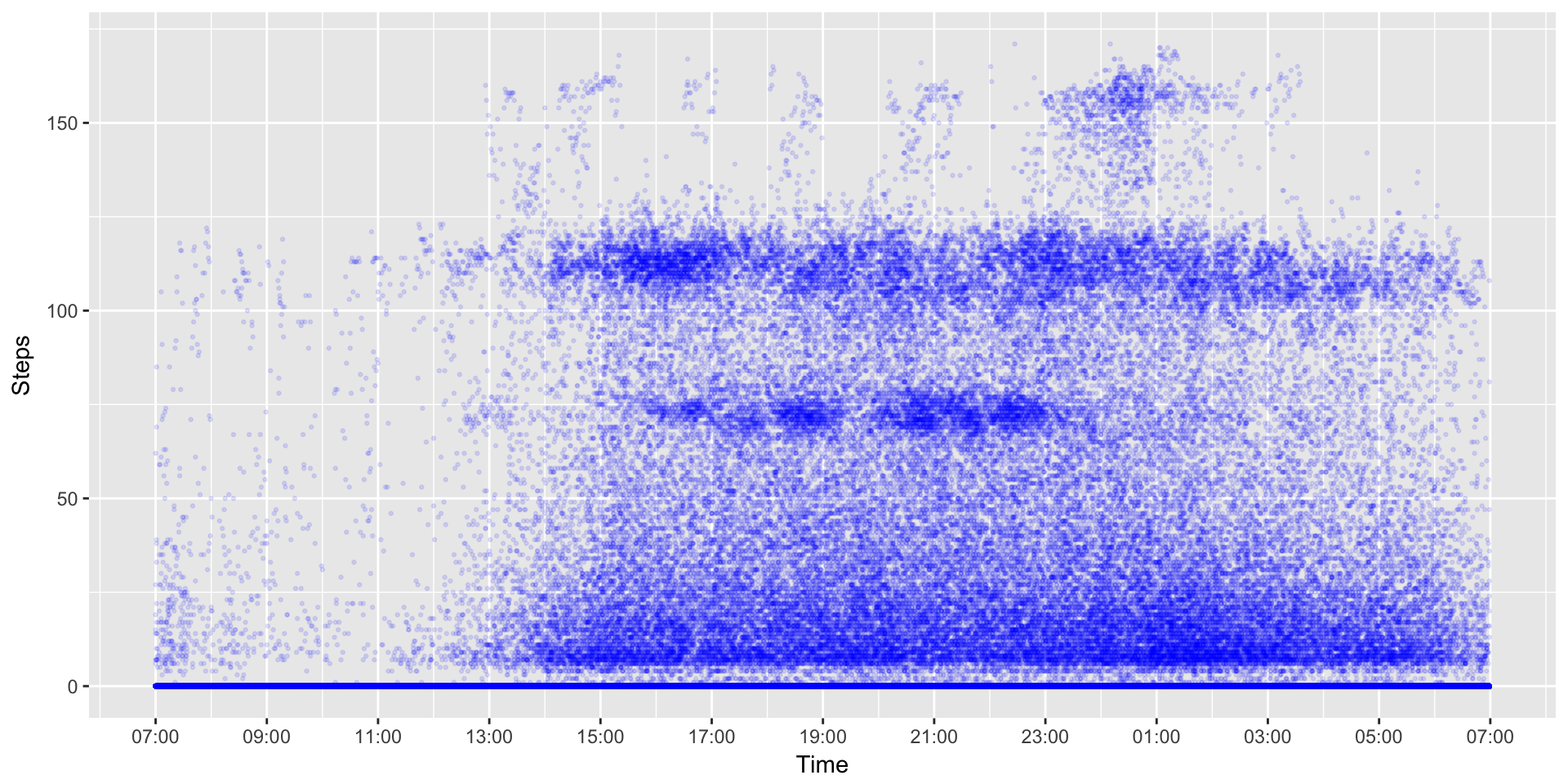
Grouping Daily Data (Multiple Lines & Facets Wrapping)
So we’ve plotted every day, and we’ve plotted every minute in our data. We’ve teased out a few simple patterns, but what about other distinctions in the data?
One of the methods common in physical activity data analysis is to explore differences across different days of the week. Are individuals more active on certain days of the week? How about the difference between weekdays and weeekend days?
To be able to create visualizations that help us understand these potential differences we’ll have to do a bit of work on the data.
First, let’s create a Day variable for our Daily data set. Again, we’re turning to the lubridate package. Lubridate has function called wday which will return the day of the week.
DailySteps$Day <- wday(DailySteps$Date, label = TRUE) # we use labels=true here to return day labels instead of numeric values. Let’s see if we can plot differences between days:
ggplot(DailySteps, aes(x=Date, y=StepTotal, group=Day, colour=Day)) + geom_path() + geom_point() + scale_x_date(breaks=date_breaks("1 month"))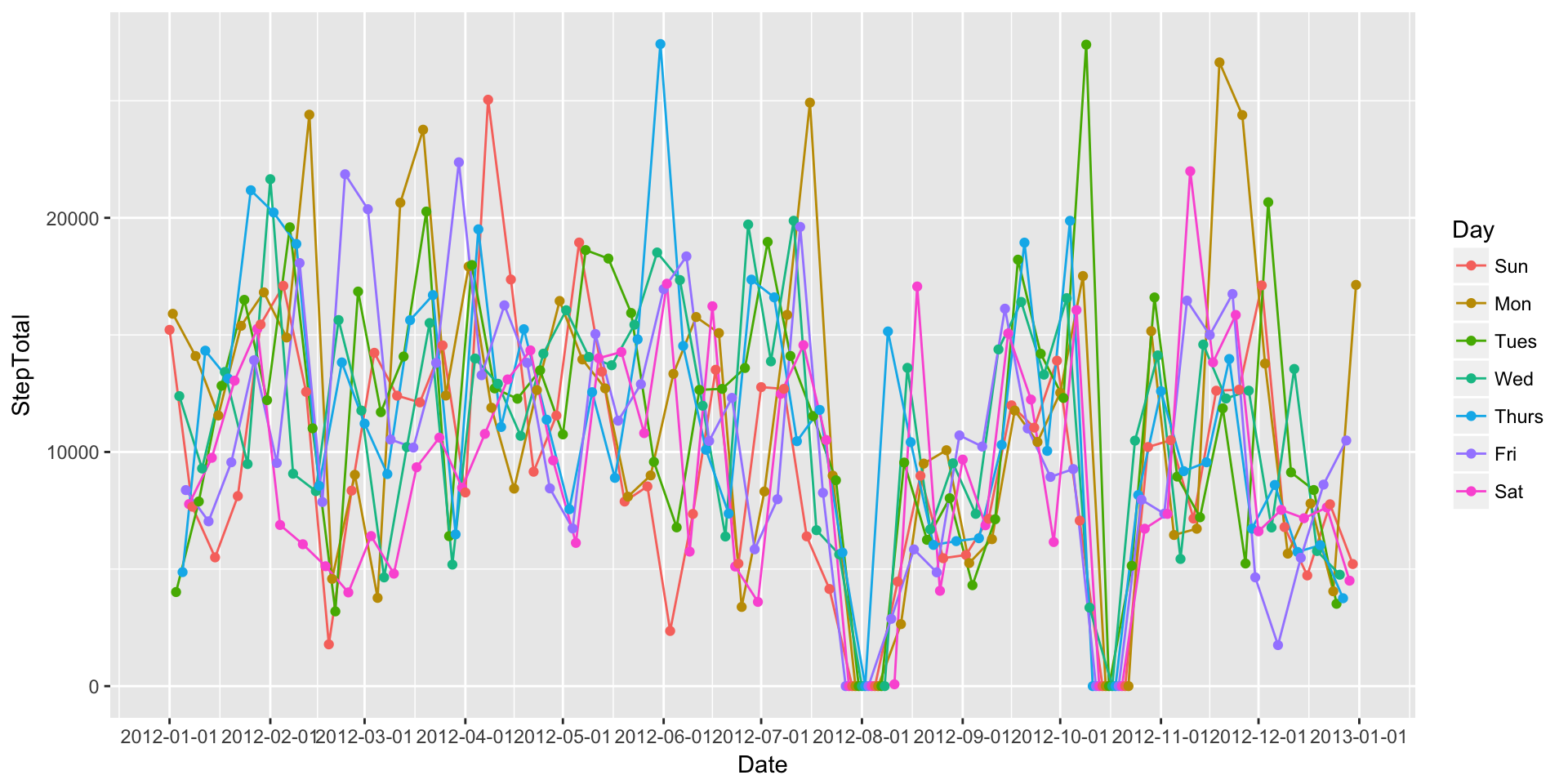
Well, that’s a mess. What if we graph each day individually? We can do this by calling creating multiple facets of the same plot.
ggplot(DailySteps, aes(x=Date, y=StepTotal, colour=Day)) +
  geom_path() +
  geom_point() +
  scale_x_date(breaks=date_breaks("1 month")) +
  facet_grid(Day ~.) +
theme(legend.position="none") 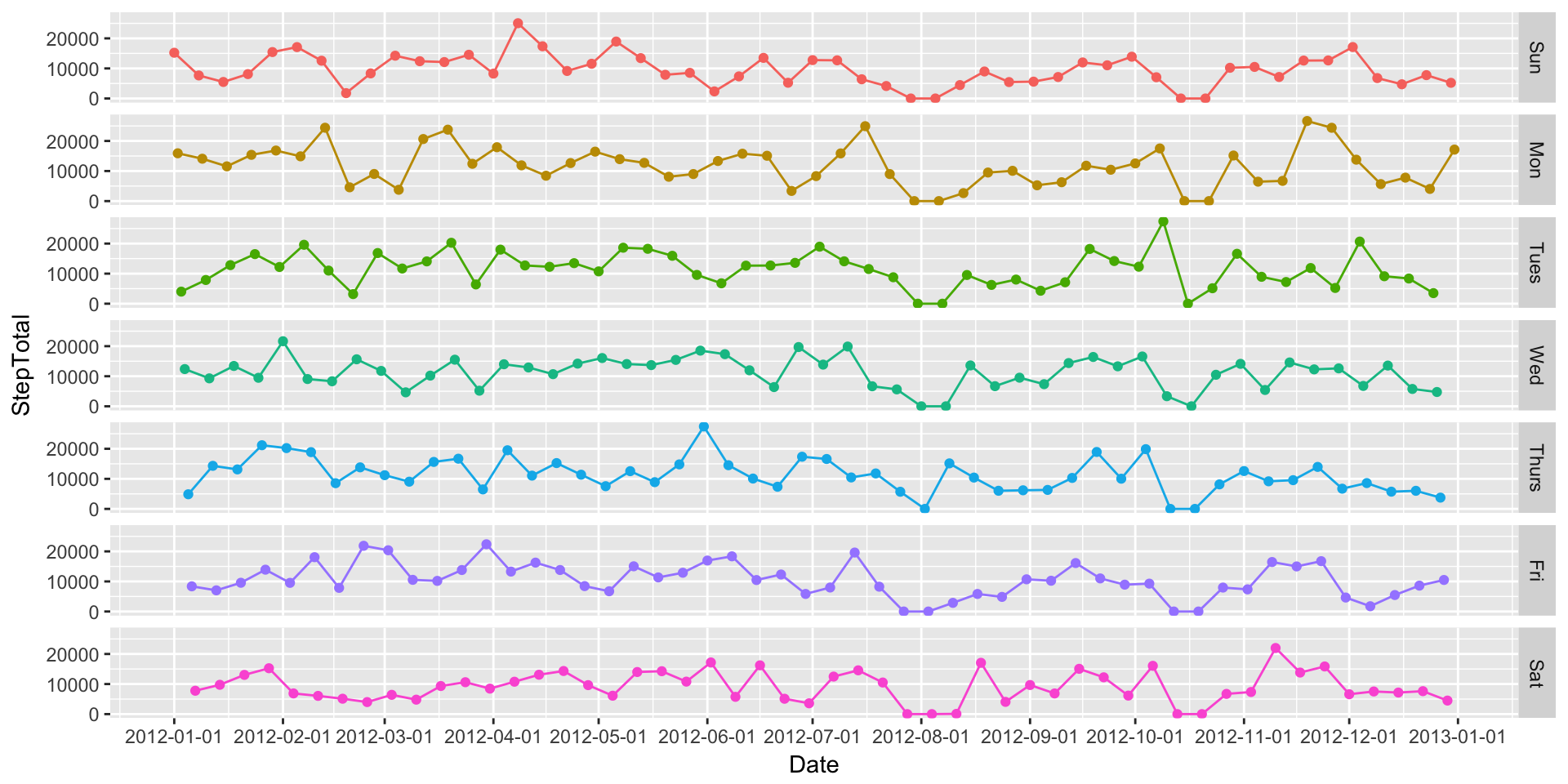
That’s a bit better, but I personally think the week starts on Monday, not Sunday. Let’s fix that in our data.
DailySteps$Day2 <- factor(DailySteps$Day, levels = c("Mon", "Tues", "Wed", "Thurs", "Fri", "Sat", "Sun"))

ggplot(DailySteps, aes(x=Date, y=StepTotal, colour=Day2)) +
  geom_path() +
  geom_point() +
  scale_x_date(breaks=date_breaks("1 month")) +
  facet_grid(Day2 ~.) +
theme(legend.position="none") 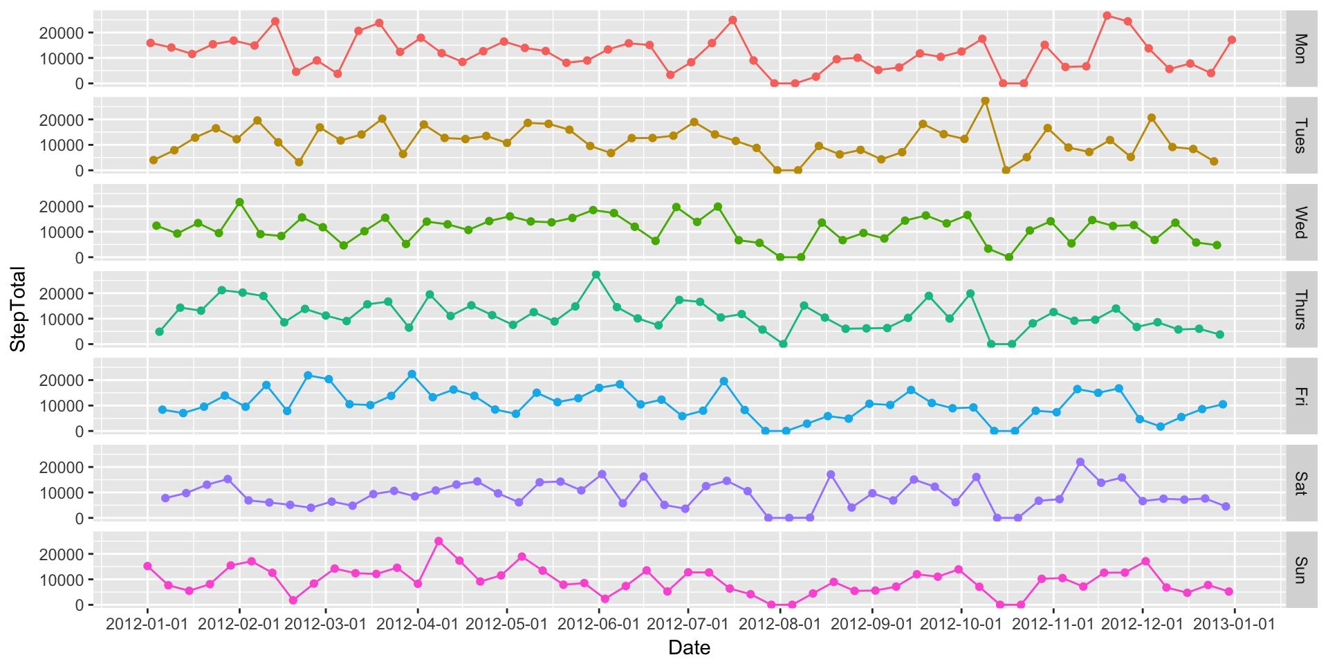
Grouping Minute Data (Multiple Lines & Facets Wrapping)
Okay, that was fun. But let’s get to the minute data. We’re basically going to do the same type of processing on the minute level data to get day of the week and then we’ll create a few different plots.
MinuteSteps$Day <- wday(MinuteSteps$Date, label = TRUE)
MinuteSteps$Day2 <- factor(DailySteps$Day, levels = c("Mon", "Tues", "Wed", "Thurs", "Fri", "Sat", "Sun"))
As you might be able to guess, plotting all the minute-level data points, even when coloured by group, is a complete mess. We’ll start with a facetted plot.
ggplot(MinuteSteps, aes(x=Time, y=Steps, colour=Day2)) +
  geom_point(size=.5, alpha = 0.1) +
  scale_x_datetime(breaks=date_breaks("2 hour"), labels=date_format("%H:%M")) +
  facet_grid(Day2 ~.) +
theme(legend.position="none") 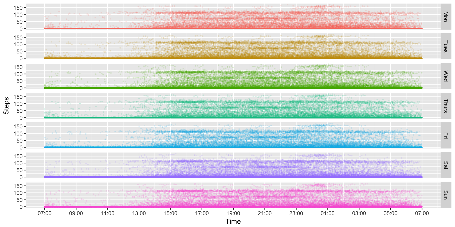
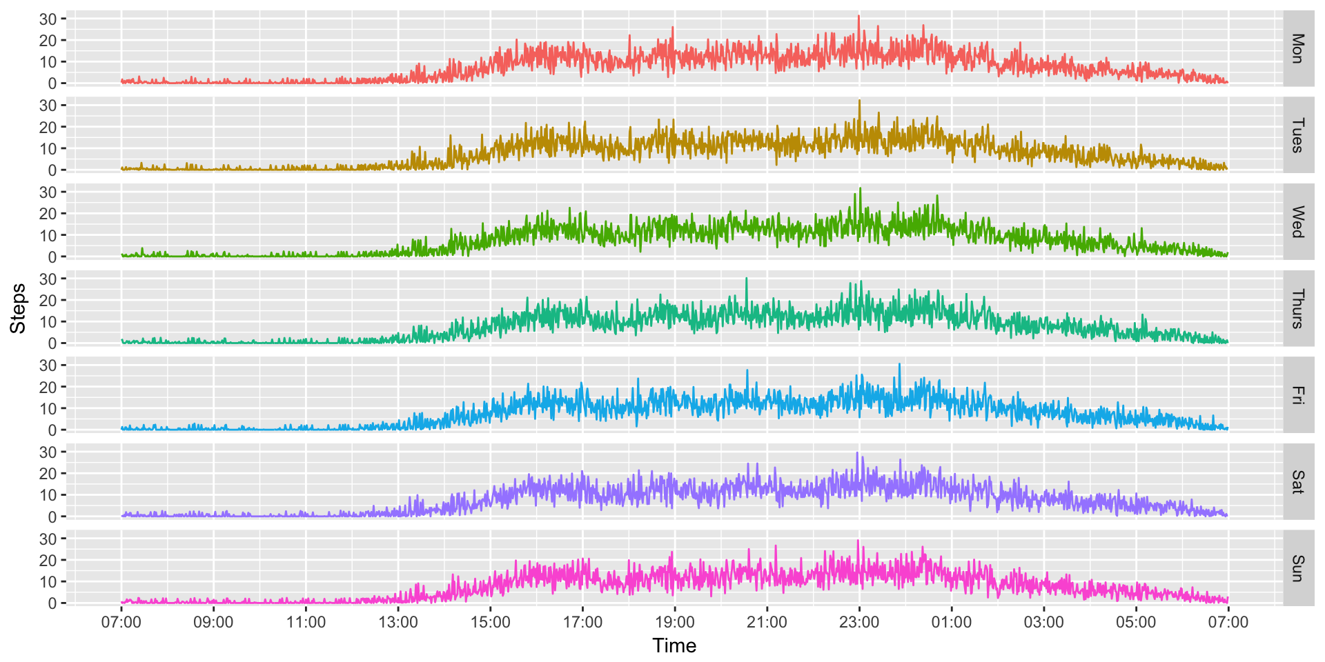
Well, that’s nice to look at, but still hard to understand any type of trends or patterns. Since we have so much data, we can probably better understand what’s going on by collapsing it. For instance, we might want to know what an “average Monday” might look like. That’s easy to do!
MinuteSteps.AvgDays <- aggregate(Steps ~ Time + Day2, MinuteSteps, mean)

ggplot(MinuteSteps.AvgDays, aes(x=Time, y=Steps, colour=Day2)) +
  geom_path() +
  scale_x_datetime(breaks=date_breaks("2 hour"), labels=date_format("%H:%M")) +
  facet_grid(Day2 ~.) +
  theme(legend.position="none")