Intro
As part of my regular work I keep a constant eye on the latest published research that involves the use of Fitbit activity tracking devices. Each new publication is gathered, read (sometimes skimmed), and tagged with appropriate meta-data for our Fitabase Research Library. It’s fun work, and it gives me a chance to peak into the every-expanding world of research and clinical use cases for consumer tracking devices and the data they can collect.
Earlier this summer, while I was traveling to a conference I came across an interesting paper published by a group from the University of South Florida that explored strategies for interpreting highly variable data from long-term use of a Fitbit. I’ll let them explain:
Data Presentation Options to Manage Variability in Physical Activity Research
This paper presents seven tactics for managing the variability evident in some physical activity data. High levels of variability in daily step-count data from pedometers or accelerometers can make typical visual inspection difficult. Therefore, the purpose of the current paper is to discuss several strategies that might facilitate the visual interpretation of highly variable data. The seven strategies discussed in this paper are phase mean and median lines, daily average per week, weekly cumulative, proportion of baseline, 7-day moving average, change point detection, and confidence intervals. We apply each strategy to a data set and discuss the advantages and disadvantages. LINK
It’s an interesting paper, with some general, easy-to-use, methods of visualizing daily-scale time series data. While reading it, I got to thinking that all of the methods they explored should be able to be easily reproducible in R. Being a sucker for practicing my R skills I set out to create some reproducible examples of each method with my own Fitbit data. A few cross-country flights later I think I’ve done a decent enough job. Let’s jump in!
Note. The data referenced below is available on Github (as you’ll see in the read_csv call). I invite you to use it so you can follow along with the examples below.
The Eight Visualization Methods
The Data
In the paper, they use approximately 180 days of daily step data from a Fitbit One that was worn by a participant in a previous study. It’s important to note that this data comes from an intervention study, with three phases: baseline, intervention phase 1, and intervention phase 2. Now, we don’t have access to their participant’s data, so I set out to use my own. Using our Fitabase platform I exported one year of daily step data, from 2016-05-12 to 2017-05-11. I also applied somewhat arbitrary cutoffs for the three phases: 30 days for “baseline”, 135 days for “intervention 1”, and 200 days for “intervention 2”.
library(tidyverse)
library(scales)
library(ggthemes)
library(lubridate)
# Load data
# format date when loading in
Daily_Steps <- read_csv("https://raw.githubusercontent.com/erramirez/datascience/master/sevenways/dailySteps_20160512_20170511.csv",
col_types = cols(
ActivityDay= col_date("%m/%d/%Y"),
StepTotal = col_integer()))
# create a day variable to number the observations by day
# used first day as "1" instead of zero
# add a observation variable with three periods
# Day 1 - 30 = baseline
# Day 31 - 165 = intervention 1
# Day 195 - 365 = intervention 2
startdate <- min(Daily_Steps$ActivityDay)
Daily_Steps <- Daily_Steps %>%
mutate(days = as.numeric(difftime(ActivityDay, startdate, units = "days") + 1),
observation = as.factor(case_when(days <= 30 ~"Baseline",
days < 195 ~ "Intervention 1",
days <= 365 ~ "Intervention 2")))1. Daily Steps
Pretty simple here, let’s just visualize the daily steps taken with days along the x-axis and total steps on the y.
In this plot, and the plots that follow I attempted to use similar formatting to what was presented in the article. They’re pretty minimal so I went with theme_bw and then made a few adjustments. Originally, I used theme_tufte from the excellent ggthemes package, but found it’s handling of axis lines a bit restrictive.
# generate a line+points plot to show one year of daily step data
# add some formatting to match journal article

daily_steps_plot <- ggplot(Daily_Steps, aes(days, StepTotal)) +
  geom_line(size = .35) +
  geom_point() +
  scale_x_continuous(breaks = seq(0,365,20), expand = c(.01, .01)) +
  scale_y_continuous(breaks = seq(0,35000,5000), limits = c(0,38000)) +
  theme_bw() +
  theme(panel.border = element_blank(), panel.grid.major = element_blank(),
        panel.grid.minor = element_blank(), axis.line = element_line(colour = "black")) +
  theme(axis.line.x = element_line(colour = "black", size = 0.5, linetype = 1),
        axis.line.y = element_line(colour = "black", size = 0.5, linetype = 1)) +
  theme(axis.text.x = element_text(size = 6)) +
  labs(title = "Daily Steps",
       x = "DAYS",
       y = "STEPS") +
  geom_vline(xintercept = c(30.5, 195.5)) +
  annotate("text", x = c(15, 112.5, 277.5), y = 38000,
           label = c("BL", "Intervention 1", "Intervention 2"))

daily_steps_plot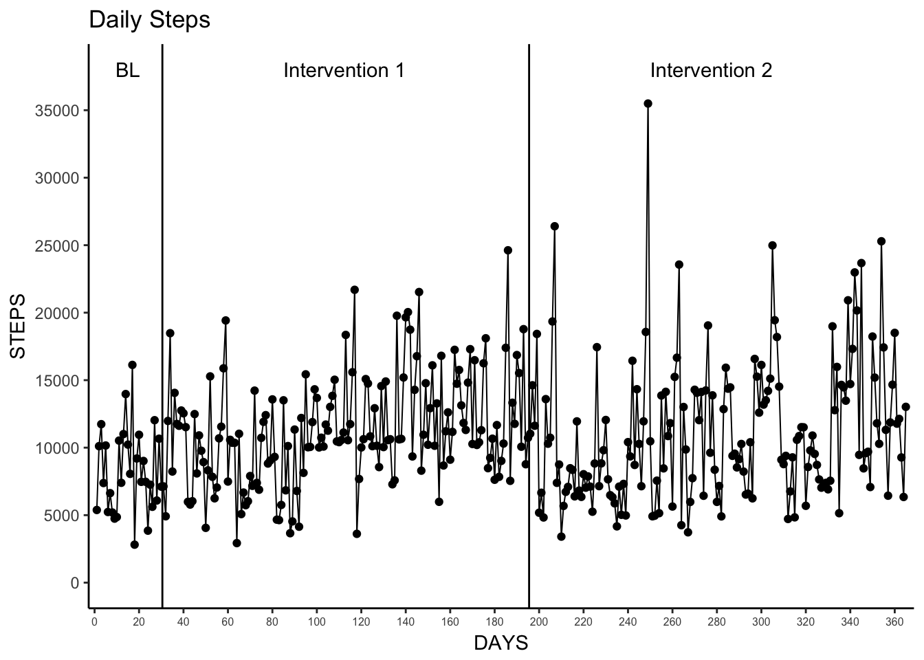
2. Phase Mean and Phase Median Lines
This was also pretty simple. To better understand how the daily steps varied from the mean and median values for each observation period (baseline, intervention 1, intervention 2) we can use group_by and summarise to easily calculate the mean and median and plug those values into geom_segment in order to plot three separate lines with the correct start and end dates.
This method of creating an additional data set to use in conjunction with geom_segment will be useful throughout the remainder to of the visualizations we go over here.
# create data sets for mean/median grouped by observation period
# also add start and stop days per observation period

observation_data <- Daily_Steps %>%
  group_by(observation) %>%
  summarise(mean = mean(StepTotal),
            median = median(StepTotal),
            start = min(days),
            end = max(days))

# create a plot with mean steps per day per observation period
# uses geom_segment and observation_data to draw mean lines

phase_mean_plot <- ggplot(Daily_Steps, aes(days, StepTotal)) +
  geom_line(size = .35) +
  geom_point() +
  scale_x_continuous(breaks = seq(0,365,20), expand = c(.01, .01)) +
  scale_y_continuous(breaks = seq(0,35000,5000), limits = c(0,35000)) +
  theme_bw() +
  theme(panel.border = element_blank(), panel.grid.major = element_blank(),
        panel.grid.minor = element_blank(), axis.line = element_line(colour = "black")) +
  theme(axis.line.x = element_line(colour = "black", size = 0.5, linetype = 1),
        axis.line.y = element_line(colour = "black", size = 0.5, linetype = 1)) +
  theme(axis.text.x = element_text(size = 6)) +
  labs(title = "Daily Steps",
       subtitle = "With Mean Steps per Day per Observation Period",
       x = "DAYS",
       y = "STEPS") +
  geom_vline(xintercept = c(30, 195)) +
  annotate("text", x = c(15, 112.5, 277.5),
           y = 34000,
           label = c("BL", "Intervention 1", "Intervention 2")) +
  geom_segment(aes(x = start, y = mean, xend = end, yend = mean), data = observation_data)

phase_mean_plot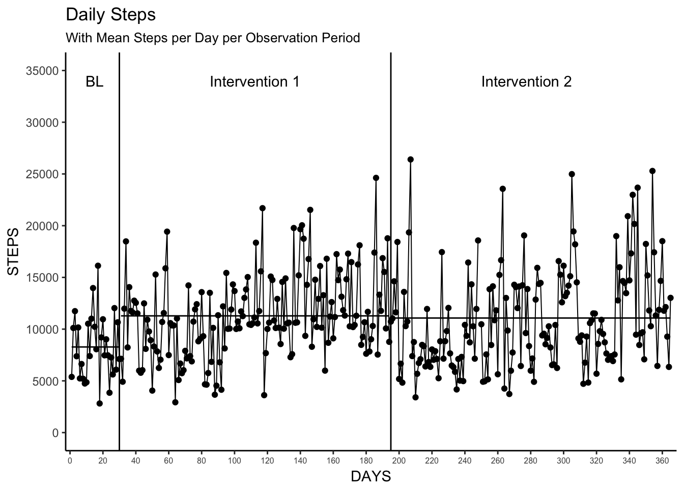
# create a plot with median steps per day per observation period
# uses geom_segment and observation_data to draw median lines

phase_median_plot <- ggplot(Daily_Steps, aes(days, StepTotal)) +
  geom_line(size = .35) +
  geom_point() +
  scale_x_continuous(breaks = seq(0,365,20), expand = c(.01, .01)) +
  scale_y_continuous(breaks = seq(0,35000,5000), limits = c(0,35000)) +
  theme_bw() +
  theme(panel.border = element_blank(), panel.grid.major = element_blank(),
        panel.grid.minor = element_blank(), axis.line = element_line(colour = "black")) +
  theme(axis.line.x = element_line(colour = "black", size = 0.5, linetype = 1),
        axis.line.y = element_line(colour = "black", size = 0.5, linetype = 1)) +
  theme(axis.text.x = element_text(size = 6)) +
  labs(title = "Daily Steps",
       subtitle = "With Median Steps per Day per Observation Period",
       x = "DAYS",
       y = "STEPS") +
  geom_vline(xintercept = c(30, 195)) +
  annotate("text", x = c(15, 112.5, 277.5),
           y = 34000,
           label = c("BL", "Intervention 1", "Intervention 2")) +
  geom_segment(aes(x = start, y = median, xend = end, yend = median), data = observation_data)

phase_median_plot 
3. Daily Average per Week and Weekly Median
Now things start to get interesting! Understanding the variability at longer time scale is a nice way to better understand how activity changes over longer periods of time. In this example, we’re reducing the daily variability to weekly variability by calculating the mean and median steps per day for each week in the data set.
While this seems easy, there are some choices we have to make here. Primarily, what is a week? Is a calendar week? Is it just seven consecutive days? If it’s a calendar week, does is start or end on Sunday? What happens when a week transverses an study phase transition?
For ease of creating reusable examples we can actually explore how to derive a “week” using two definitions:
- A Monday-Sunday seven-day week
- A running seven-day week, regardless of day of the week
In this first method, we use isoweek from the lubridate package to find the week number based on a Monday-Sunday week. Keep in mind that our data spans both 2016 and 2017, so the resulting week variable will repeat and return the same value for the beginning and ending observations since the data doesn’t start on a Monday. I also wanted to create a variable, weeknum, that reflected the number of weeks elapsed. Last week I was exploring how to calculate streaks in data, and stumbled upon a great comment stackoverflow about numbering runs in a series. I applied that here, and started weeknum at 1 instead of 0.
# create week variable based on isoweek
# create weenum variable for running week number as weeknum restarts at begining of the year
Daily_Steps <- Daily_Steps %>%
  mutate(week = isoweek(Daily_Steps$ActivityDay),
         weeknum = c(0,cumsum(week[-1L] != week[-length(week)]))+1
  )
In the second method, wanted to explore how to set a week as seven consecutive daily observations regardless of the day of the week. I had some old code I used during my dissertation that I was able to re-use here. It’s not pretty and could probably be updated to make use of tidyverse principles, but it works for now. (Tips/ideas on how to improve this section are welcomed!)
# function to create data frame of length: 7 observations
weekwindow <- function(x) {
  week <- x[n:(n+6),]
  return(week)
}

# initialize n to value 1
n <- 1

#create empty list
Daily_Steps_list <- list()

#loop through data and append 7-day moving windows to the list
for (i in 1:53) { #set length of function to 1:number of weeks in the data set
  df <- weekwindow(Daily_Steps) #create a new dataframe based on weekwindow function
  df$dayreg <- c(1:nrow(df)) #create a new variable and set to the day in the 7-day window (1:7)
  df$week <- i #create a new variable and set to the value of i; gives week number
  Daily_Steps_list[[i]] <- df #adds the dataframe (df) to the empty list previously set
  n <- n+7 #increments n by 7 so weeknumber function calls next 7 days.
}

# combine all 7-day/week data frames in week.list into a single dataframe
# get rid of trailing NA entries from week 53
Daily_Steps_7DayWeek <- bind_rows(Daily_Steps_list) %>%
  filter(ActivityDay <= "2017-05-11")
So now, we have two data sets that reflect two different ways to explore weeks in our data. Now comes the fun part - visualizing it! I personally like calendar weeks (isoweek / method one above), as they make conceptual sense when we’re talking about dates so I’ll use that data as the basis for creating the plots. First, we have to create the summarized data set so we have the daily mean, median and standard deviation per week. We do have to keep in mind here that not all weeks will have seven days as observations may have started/ended in the middle of a week (in this data week 1 only has 4 days).
# summarize data by week number
# append observation variable to summarized weekly data
# Baseline = Weeks 1-5
# Intervention 1 = Weeks 6-28
# Intervention 2 = Weeks 29-53
Mean_Median_Week <- Daily_Steps %>%
  group_by(weeknum) %>%
  summarise(mean = mean(StepTotal),
            median = median(StepTotal),
            sd = sd(StepTotal)) %>%
  mutate(observation = case_when(weeknum <= 5 ~ "Baseline",
                                 weeknum <= 28 ~ "Intervention 1",
                                 weeknum <= 53 ~ "Intervention 2")
         )
Now we can plot. We’ll use a good deal of the code we used in the previous plots here. However, note that we’re grouping by the observation so that we have distinct series visualized in the plot.
# plot the mean week with standard deviation error bars
# seperate the oberservation periods using geom_vline
Mean_Week <- ggplot(Mean_Median_Week, aes(weeknum, mean, group = observation)) +
  geom_point() +
  geom_line() +
  geom_errorbar(aes(ymin = mean-sd, ymax = mean+sd), width = .5) +
  scale_x_continuous(breaks = seq(0,53,1), limits = c(0,53), expand = c(.01, .01)) +
  scale_y_continuous(breaks = seq(0,28000,2000), limits = c(0,28000)) +
  #theme_tufte() +
  #geom_rangeframe() +
  theme_bw() +
  theme(panel.border = element_blank(), panel.grid.major = element_blank(),
        panel.grid.minor = element_blank(), axis.line = element_line(colour = "black")) +
  theme(axis.line.x = element_line(colour = "black", size = 0.5, linetype = 1),
        axis.line.y = element_line(colour = "black", size = 0.5, linetype = 1)) +
  theme(axis.text.x = element_text(size = 6)) +
  labs(title = "Daily Average Steps per Week",
       x = "WEEKS",
       y = "AVERAGE DAILY STEPS",
       caption = "Note: Error bars depict the standard deviation of the mean.") +
  geom_vline(xintercept = c(5.5, 28.5)) +
  annotate("text", x = c(2.25, 16, 42),
           y = 25000,
           label = c("BL", "Intervention 1", "Intervention 2"))

Mean_Week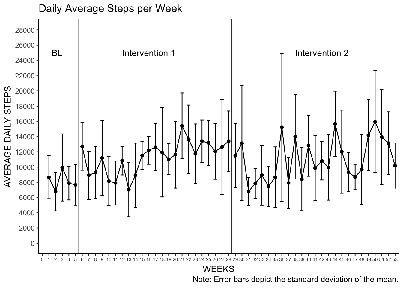
# plot the median step counts per week
Median_Week <- ggplot(Mean_Median_Week, aes(weeknum, median, group = observation)) +
  geom_point() +
  geom_line() +
  scale_x_continuous(breaks = seq(0,53,1), limits = c(0,53), expand = c(.01, .01)) +
  scale_y_continuous(breaks = seq(0,19000,2000), limits = c(0,19000)) +
  theme_bw() +
  theme(panel.border = element_blank(), panel.grid.major = element_blank(),
        panel.grid.minor = element_blank(), axis.line = element_line(colour = "black")) +
  theme(axis.line.x = element_line(colour = "black", size = 0.5, linetype = 1),
        axis.line.y = element_line(colour = "black", size = 0.5, linetype = 1)) +
  theme(axis.text.x = element_text(size = 6)) +
  labs(title = "Median Daily Steps per Week",
       x = "WEEKS",
       y = "MEDIAN DAILY STEPS") +
  geom_vline(xintercept = c(5.5, 28.5)) +
annotate("text", x = c(2.25, 16, 42),
           y = 18000,
           label = c("BL", "Intervention 1", "Intervention 2"))
Median_Week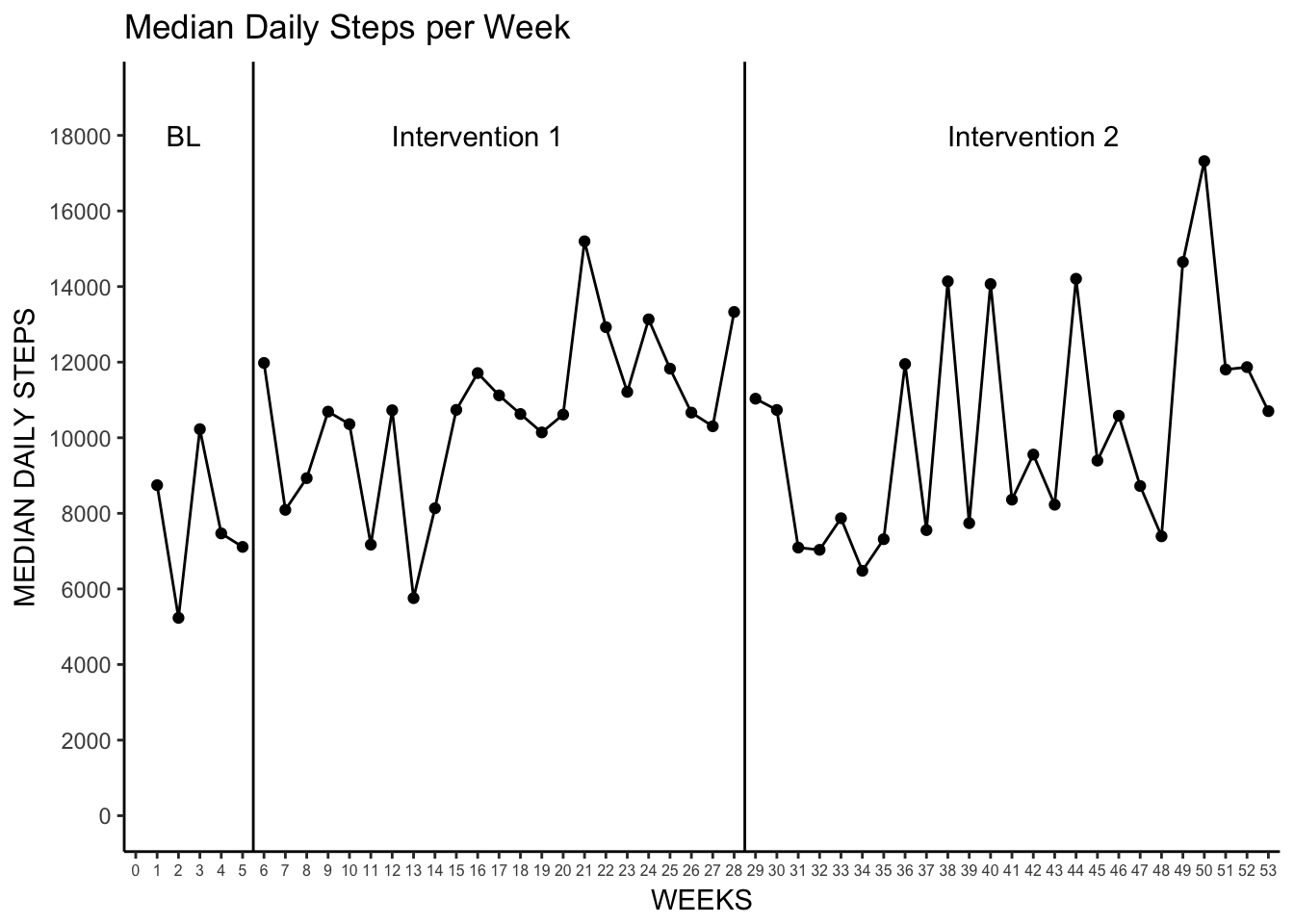
4. Weekly Cumulative
This is actually one of the easier visualizations as we can make use of our previously calculated weeknum to calculate the weekly cumulative sum.
Why would weekly cumulative sums be interesting? Well, many interventions may focus on the weekly total steps (10,000 per day is 70,000 per week), and this plot can quickly show you when those weekly goals are met. This type of visualization also provides a way to see day-to-day variation and week-to-week variation in activity within one plot. By quickly glancing at the vertical space between linked data points one can see if there are days of either outstanding activity, or lack there of.
You can also see here that the week 1 observation started on a Thursday as there are only four days of observation for week 1 (and again for week 53).
# first create a new data set with an new variable that has the weekly cumulative sum of StepTotal
Daily_Steps_Week_Cumulative <- Daily_Steps %>%
  group_by(weeknum) %>%
  mutate(cs = cumsum(StepTotal))

# create plot of the weekly cumulative steps
# each line is a week using group = weeknum

Weekly_Cumulative <- ggplot(Daily_Steps_Week_Cumulative, aes(days, cs, group = weeknum)) +
  geom_point() +
  geom_line() +
  scale_x_continuous(breaks = seq(0,365,20), expand = c(.01, .01)) +
  scale_y_continuous(breaks = seq(0,120000,20000)) +
  theme_bw() +
  theme(panel.border = element_blank(), panel.grid.major = element_blank(),
        panel.grid.minor = element_blank(), axis.line = element_line(colour = "black")) +
  theme(axis.line.x = element_line(colour = "black", size = 0.5, linetype = 1),
        axis.line.y = element_line(colour = "black", size = 0.5, linetype = 1)) +
  theme(axis.text.x = element_text(size = 6)) +
  labs(title = "Weekly Cumulative Steps",
       x = "DAYS",
       y = "STEPS") +
  geom_vline(xintercept = c(32.5, 193.5)) +
  annotate("text", x = c(15, 112.5, 277.5), y = 130000,
           label = c("BL", "Intervention 1", "Intervention 2"))

Weekly_Cumulative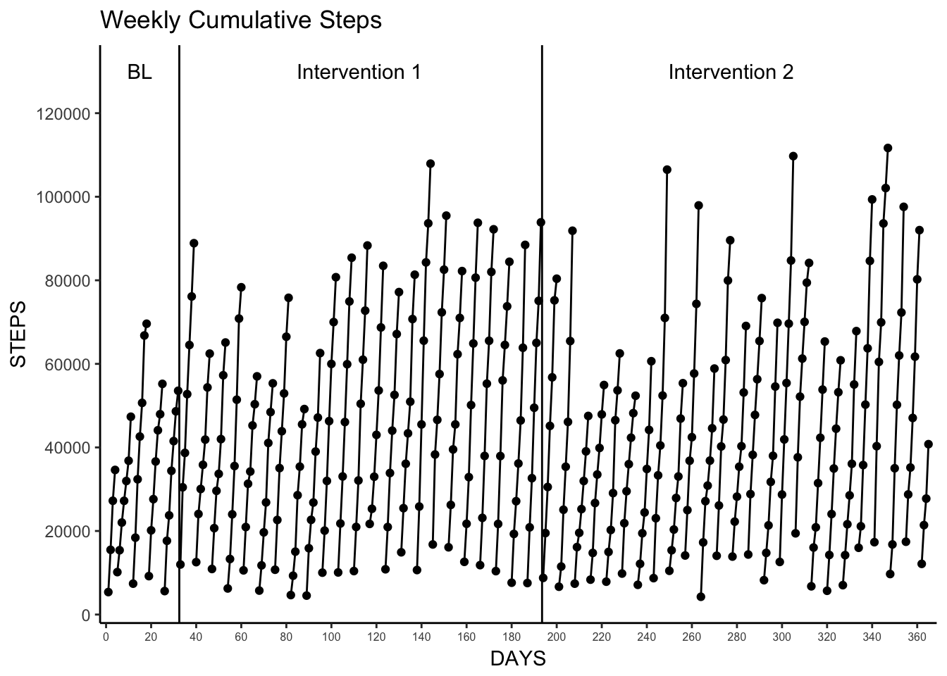
5. Proportion of Baseline Mean and Proportion of Baseline Median
In these visualizations we want to see how daily steps compared to the the mean and median of the baseline value. First we create a small data set based on our previously created observation_data (see Phase Mean/Median above) that contains our baseline mean and median value, and then create our proportion data sets. After that straightforward process it’s relatively simple to generate the plots using much of the same code we’ve used previously. We also use the “end” of the baseline phase (in number of days) to create a new “days” variable so that the Intervention 1 phase starts at “day 1”.
Note. I had some trouble figuring out how to properly apply a logarithmic scale to the y-axis, but a quick trip in to Stack Overflow helped me find scale_y_log10 and use it here.
# create a dataframe of just data from the "baseline" phase
baseline_values <- observation_data %>%
  filter(observation == "Baseline")

# create a dataframe of daily proportions for "intervention 1" and "intervention 2" phases
# use the end of baseline (in days) to create new days2 variable to start "intervention 1" at day 1
proportions <- Daily_Steps %>%
  filter(observation != "Baseline") %>%
  mutate(proportion_mean = (StepTotal / baseline_values$mean),
         proportion_median = (StepTotal / baseline_values$median),
         days2 = (days - baseline_values$end))

# create mean and medians of the proportions within each phase
# also creat start/end days for use with geom_segment to create start/stop points for horizontal lines
proportions_mean_median <- proportions %>%
  group_by(observation) %>%
  summarize(mean = mean(proportion_mean),
            median = median(proportion_median),
            start = min(days2),
            end = max(days2))

# separate "intervention 1"  data into a dataframe for use in geom_segment
proportion_intervention1_data<- proportions_mean_median %>%
  filter(observation == "Intervention 1")

# separate "intervention 2"  data into a dataframe for use in geom_segment
proportion_intervention2_data<- proportions_mean_median %>%
  filter(observation == "Intervention 2")

# create mean proportion plot
# use scale_y_log10 and annotation_logticks to try and match original paper visualization
Proportion_Mean_Plot <- ggplot(proportions, aes(days2, proportion_mean, group = observation)) +
  geom_line() +
  geom_point(aes(shape = observation)) +
  scale_shape_manual(values=c(16,0)) +
  scale_x_continuous(breaks = seq(0,335,20), expand = c(.01, .01)) +
  scale_y_log10(breaks = c(0.1, 1, 10), limits = c(0.1, 10)) +
  annotation_logticks(sides = "l") +
  theme_bw() +
  theme(panel.border = element_blank(), panel.grid.major = element_blank(),
        panel.grid.minor = element_blank(), axis.line = element_line(colour = "black")) +
  theme(axis.line.x = element_line(colour = "black", size = 0.5, linetype = 1),
        axis.line.y = element_line(colour = "black", size = 0.5, linetype = 1)) +
  theme(axis.text.x = element_text(size = 6)) +
  theme(legend.position="none") +
  labs(title = "Proportion of Baseline Mean",
       subtitle = "Daily steps within each intervention phase",
       x = "DAYS WITHIN PHASE",
       y = "PROPORTION OF BASELINE \n(MEAN)") +
  geom_vline(xintercept = 164.5) +
  geom_hline(yintercept = 1) +
  annotate("text", x = c(82, 246), y = 10,
           label = c("Intervention 1", "Intervention 2")) +
  geom_segment(aes(x = 0, y = mean, xend = end, yend = mean),
               data = proportion_intervention1_data) +
  geom_segment(aes(x = start, y = mean, xend = end, yend = mean),
               data = proportion_intervention2_data, linetype = 3)

Proportion_Mean_Plot
# create median proportion plot
# use scale_y_log10 and annotation_logticks to try and match original paper visualization
Proportion_Median_Plot <- ggplot(proportions, aes(days2, proportion_median, group = observation)) +
  geom_point(aes(shape = observation)) +
  scale_shape_manual(values=c(16,0)) +
  geom_line() +
  scale_x_continuous(breaks = seq(0,335,20), expand = c(.01, .01)) +
  scale_y_log10(breaks = c(0.1, 1, 10), limits = c(0.1, 10)) +
  annotation_logticks(sides = "l") +
  theme_bw() +
  theme(panel.border = element_blank(), panel.grid.major = element_blank(),
        panel.grid.minor = element_blank(), axis.line = element_line(colour = "black")) +
  theme(axis.line.x = element_line(colour = "black", size = 0.5, linetype = 1),
        axis.line.y = element_line(colour = "black", size = 0.5, linetype = 1)) +
  theme(axis.text.x = element_text(size = 6)) +
  theme(legend.position="none") +
  theme(axis.line.x = element_line(colour = "black", size = 0.5, linetype = 1),
        axis.line.y = element_line(colour = "black", size = 0.5, linetype = 1)) +
  labs(title = "Proportion of Baseline Median",
       subtitle = "Daily steps within each intervention phase",
       x = "DAYS WITHIN PHASE",
       y = "PROPORTION OF BASELINE \n(MEDIAN)") +
  geom_vline(xintercept = 164.5) +
  geom_hline(yintercept = 1) +
  annotate("text", x = c(82, 246), y = 10,
           label = c("Intervention 1", "Intervention 2")) +
  geom_segment(aes(x = 0, y = median, xend = end, yend = median),
               data = proportion_intervention1_data, linetype = 2) +
  geom_segment(aes(x = start, y = median, xend = end, yend = median),
               data = proportion_intervention2_data, linetype = 3)

Proportion_Median_Plot
6. 7-Day Moving Average
The 7-day moving average is one of my favorite methods for visualizing trends in messy highly variable time series data. As the authors of the paper noted, the running average method reduces variability, but it makes spotting those important trends much easier.
To calculate the 7-day average we can use the zoo package and it’s rollmean function. Note that doing so automatically will remove the first 6 days of each phase as the seventh day in each phase is the first to have a true 7-day mean value.
# install zoo package if not already installed
# install.packages("zoo")

# load zoo package
library(zoo)

# create 7-day average data set
# we only want rolling 7-day within each observation so we use group_by first
Daily_Steps_7DMAV <- Daily_Steps %>%
  group_by(observation) %>%
  mutate(sevenmav = rollmean(StepTotal, 7, fill = NA, align = "right"))

# plot the 7-day moving average
movingavg_plot <- ggplot(Daily_Steps_7DMAV, aes(days, sevenmav)) +
  geom_line(size = .35) +
  geom_point() +
  scale_x_continuous(breaks = seq(0,365,20), expand = c(.01, .01)) +
  scale_y_continuous(breaks = seq(0,35000,5000), limits = c(0,35000)) +
  theme_bw() +
  theme(panel.border = element_blank(), panel.grid.major = element_blank(),
        panel.grid.minor = element_blank(), axis.line = element_line(colour = "black")) +
  theme(axis.line.x = element_line(colour = "black", size = 0.5, linetype = 1),
        axis.line.y = element_line(colour = "black", size = 0.5, linetype = 1)) +
  theme(axis.text.x = element_text(size = 6)) +
  labs(title = "7-Day Moving Average",
       x = "DAYS",
       y = "STEPS (MOVING AVERAGE)") +
  geom_vline(xintercept = c(30.5, 195.5)) +
  annotate("text", x = c(15, 112.5, 277.5), y = 38000, label = c("BL", "Intervention 1", "Intervention 2"))

movingavg_plot
7. Confidence Intervals
This is where my statistical knowledge begins to falter, but by relying on the methodology in the paper I was able to recreate their process for creating confidence intervals.
I used the freely available SMA application from clinicalresearcher.org (as reference in the paper) to run the bootstrapping procedure to produce the confidence intervals. It’s important to note that the authors decided to reduce the number of data points to only the last 28 days of each phase (84 total days) in their analysis as the SMA software states that their bootstrapping method is primarily for “analyzing short streams (n<30 per phase) of auto-correlated time-series data.” I replicated that procedure here as well. The resulting upper and lower bounds for the 95% confidence interval were then plotted. As you can see here in the plot, there is a significant difference between the Baseline phase and Intervention 1 and the Baseline phase and Intervention 2.
# create new data sets that only include the last 28 days of each phase.
Baseline_28 <-  Daily_Steps %>%
  filter(observation == "Baseline",
         days > 2)
Intervention1_28 <- Daily_Steps %>%
  filter(observation == "Intervention 1",
         days > (194-28))
Intervention2_28 <- Daily_Steps %>%
  filter(observation == "Intervention 2",
         days > (365-28))

# bind all those 28-day data sets together and export it as a CSV to use in SMA application.
SMA_Data <- bind_rows(Baseline_28, Intervention1_28, Intervention2_28)
write_csv(SMA_Data, "~/Downloads/SMA_Data.csv")
After copying the “last 28” days data into the SMA application and setting the number of iterations to 20,000, the resulting output is saved as a .txt file. You can access that output here.
We can then take those 95% CI values from the output for each phase and add them to the observation_date data set we created for the phase means/medians plots. Then we append those values to the full Daily_Steps data set and plot it!
# add 95% CI values as lowe/upper CI variables
observation_data$lowerCI <- c(7211.57, 11247.89, 12070.50)
observation_data$upperCI <- c(9480.32, 14303.11, 15935.50)

# append the CI values to the full Daily_Steps data set
Daily_Steps_CI <- Daily_Steps %>% left_join(., observation_data)

# plot the 95% CI using combination of geom_segment (for lower/upper CI lines) and geom_ribbon (for shadding)
CI_plot <- ggplot(Daily_Steps_CI, aes(days, StepTotal)) +
  geom_line(size = .35) +
  geom_point() +
  scale_x_continuous(breaks = seq(0,365,20), expand = c(.01, .01)) +
  scale_y_continuous(breaks = seq(0,35000,5000)) +
  theme_bw() +
  theme(panel.border = element_blank(), panel.grid.major = element_blank(),
        panel.grid.minor = element_blank(), axis.line = element_line(colour = "black")) +
  theme(axis.line.x = element_line(colour = "black", size = 0.5, linetype = 1),
        axis.line.y = element_line(colour = "black", size = 0.5, linetype = 1)) +
  theme(axis.text.x = element_text(size = 6)) +
  labs(title = "Daily Steps",
       subtitle = "With 95% confidence interval",
       x = "DAYS",
       y = "STEPS") +
  geom_vline(xintercept = c(30, 195)) +
  annotate("text", x = c(15, 112.5, 277.5),
           y = 38000,
           label = c("BL", "Intervention 1", "Intervention 2")) +
  geom_segment(aes(x = start, y = lowerCI, xend = end, yend = lowerCI), data = observation_data, linetype = 2) +
  geom_segment(aes(x = start, y = upperCI, xend = end, yend = upperCI), data = observation_data, linetype = 2) +
  geom_ribbon(aes(ymin = lowerCI, ymax = upperCI), alpha = .2)

CI_plot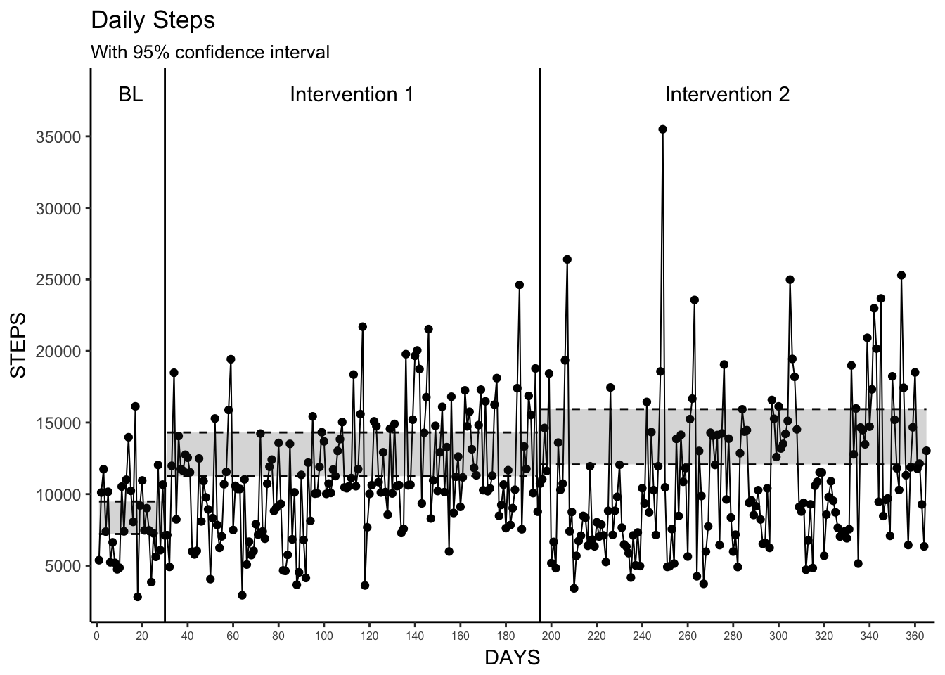
8. Change-point Detection
Change-point detection is a very interesting method for determining when significant changes occur in time series data. Here we use the changepoint package and the cpt.mean function to detect the significant changes in the mean. The authors use binnary segmentation and limit the number of detectable change points to be equal to the number of phase changes (2), and I apply the same methods here. We then plot those changes with horizontal dashed lines that represent the mean values for each detected significant state. I also include the default changepoint plot here for comparison.
Unsurprisingly, we don’t see any agreement with the observed changepoints as determined by the analysis and the phase changes. This is due to the arbitrary definition of our phases here, but that is not to say this changepoint method is without merit. With a “real” observed baseline/intervention one could use this simple analytical technique and quick visualization to see if changes in intervention(s) actually makes a significant difference in the outcome.
I’ll also noted, that one of the more interesting uses of changepoint detection is to run this analysis “live” on data as it is created, thus being able to have a more automated way to understand significant changes in outcomes as you’re measuring them. Something that may be useful for just-in-time interventions or more personalized measurement studies. I found this blog post from the Twitter engineering group to be very helpful when I was wrapping my head around this methodology.
#install.packages("changepoint")
library(changepoint)

# create a changepoint opject using the cpt.mean function with the parameters used in the paper
change <- cpt.mean(Daily_Steps$StepTotal, method="BinSeg", Q=2)
plot(change) # the default changepoint plot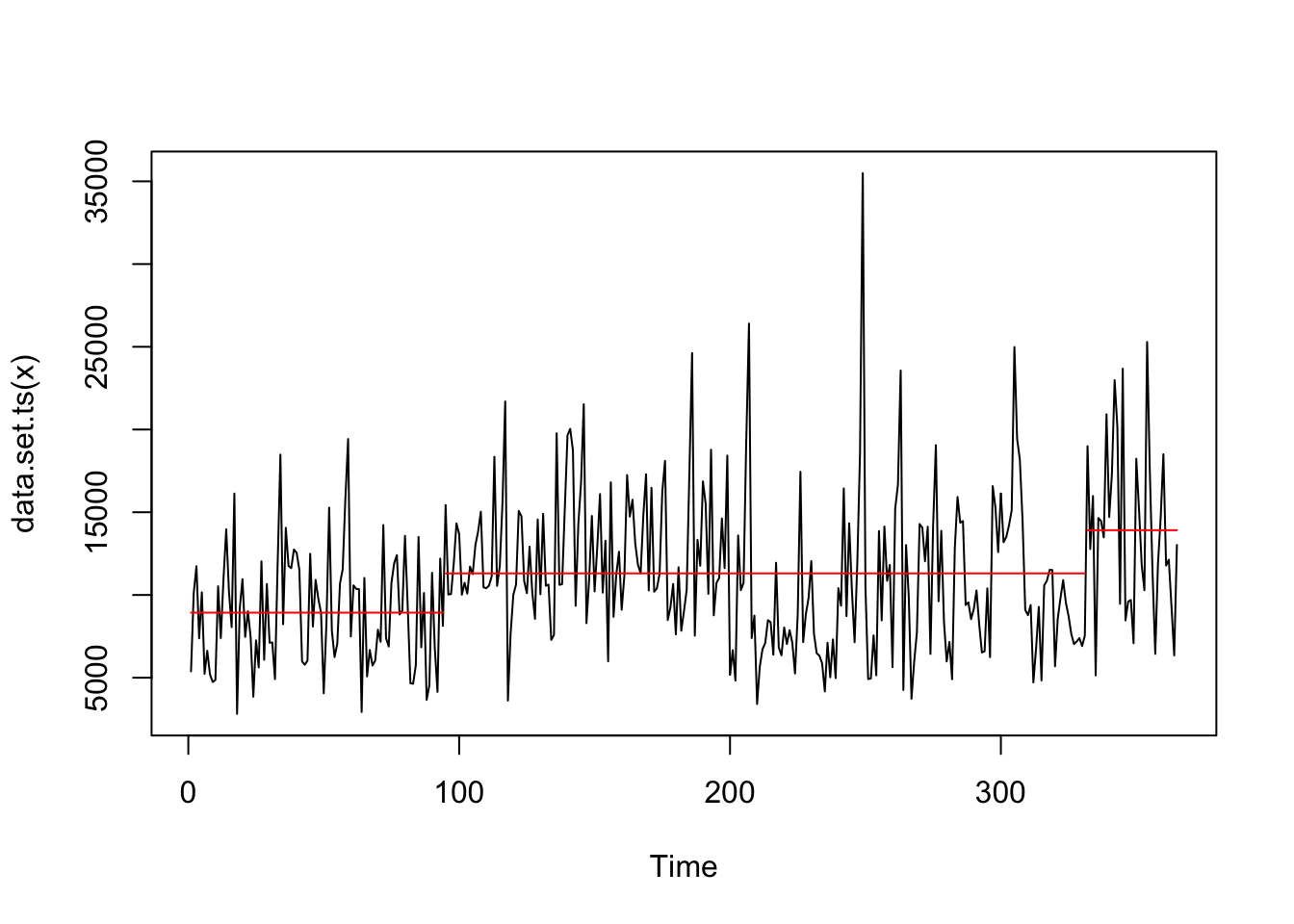
change## Class 'cpt' : Changepoint Object
## ~~ : S4 class containing 14 slots with names
## cpts.full pen.value.full data.set cpttype method test.stat pen.type pen.value minseglen cpts ncpts.max param.est date version
##
## Created on : Fri Apr 21 18:46:22 2017
##
## summary(.) :
## ----------
## Created Using changepoint version 2.2.2
## Changepoint type : Change in mean
## Method of analysis : BinSeg
## Test Statistic : Normal
## Type of penalty : MBIC with value, 17.69969
## Minimum Segment Length : 1
## Maximum no. of cpts : 2
## Changepoint Locations : 94 331
## Range of segmentations:
## [,1] [,2]
## [1,] 94 NA
## [2,] 94 331
##
## For penalty values: 509315501 202651677# add a changepoint variable based on the output of the changepoint analysis
Daily_Steps <- Daily_Steps %>%
mutate(changepoints = case_when(days <= 94 ~ 1,
days <= 331 ~ 2,
days > 331 ~ 3))
# create a data set of mean values for each change point to be used with geom_segment in the plot
change_means <- Daily_Steps %>%
group_by(changepoints) %>%
summarize(mean = mean(StepTotal),
start = min(days),
end = max(days))
# plot it!
changepoint_plot <- ggplot(Daily_Steps, aes(days, StepTotal)) +
geom_line(size = .35) +
geom_point() +
scale_x_continuous(breaks = seq(0,365,20), expand = c(.01, .01)) +
scale_y_continuous(breaks = seq(0,35000,5000), limits = c(0,35000)) +
theme_bw() +
theme(panel.border = element_blank(), panel.grid.major = element_blank(),
panel.grid.minor = element_blank(), axis.line = element_line(colour = "black")) +
theme(axis.line.x = element_line(colour = "black", size = 0.5, linetype = 1),
axis.line.y = element_line(colour = "black", size = 0.5, linetype = 1)) +
theme(axis.text.x = element_text(size = 6)) +
labs(title = "Daily Steps",
subtitle = "With detected change points",
x = "DAYS",
y = "STEPS") +
geom_vline(xintercept = c(30, 195)) +
annotate("text", x = c(15, 112.5, 277.5),
y = 38000,
label = c("BL", "Intervention 1", "Intervention 2")) +
geom_segment(aes(x = start, y = mean, xend = end, yend = mean), data = change_means, linetype = 2)
changepoint_plot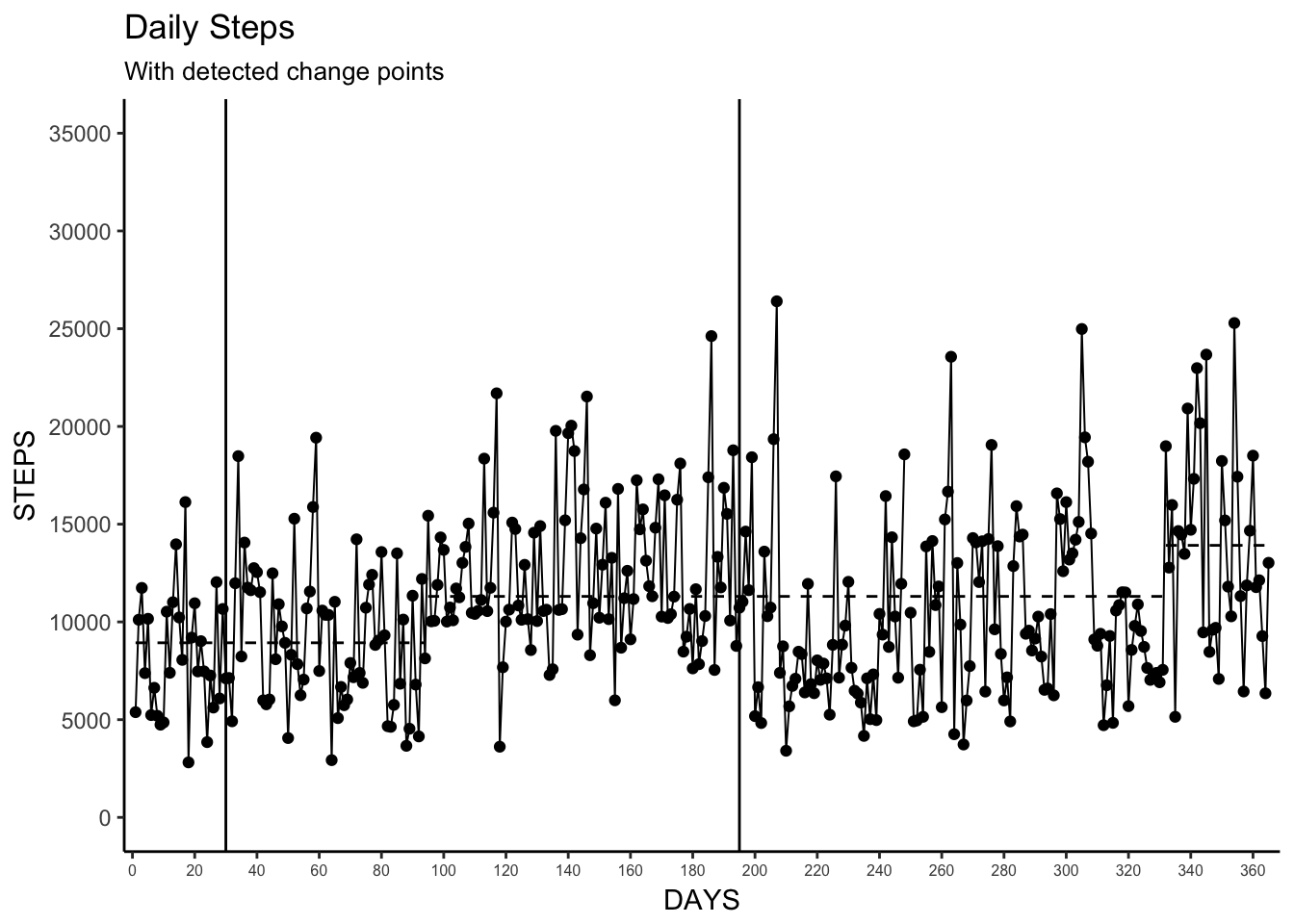
Wrapping Up
Well, that was fun! I know I learned a lot more about using ggplot, and some analytic methods, that can be used for examining time series data. I’m lucky to have a lot of time series data at my disposal to play around with these visualization methods and I hope this can be useful for you as well.
More broadly, I hope this this just another gentle push for our research community to share more code and examples alongside their published work. Sharing is caring folks!
As always, comments and edits are welcome. Feel free to submit a pull request or issue on Github, or just ping me on twitter.